Challenge
Our inspiration was taken from a mixture of two different cultures:
- the Indian traditional style with the attractive color combination related to the #1 ranking in the rice production
- the European modern style with clean and artistic layout design related to the #1 ranking in food processing.
So our inspiration came from the combination and the strong link between the top Indian rice production and the leading European food processing.
Creation
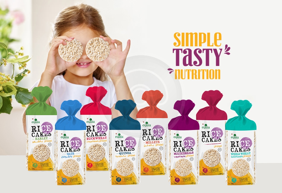
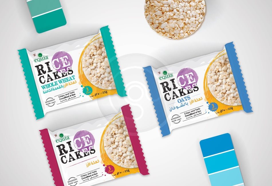
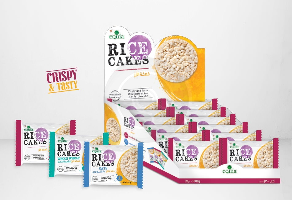
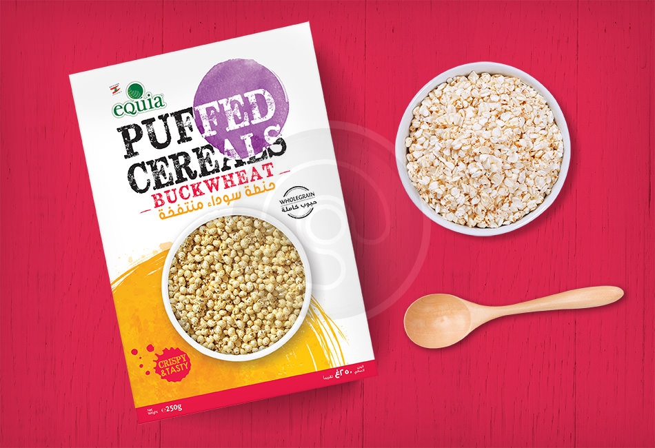
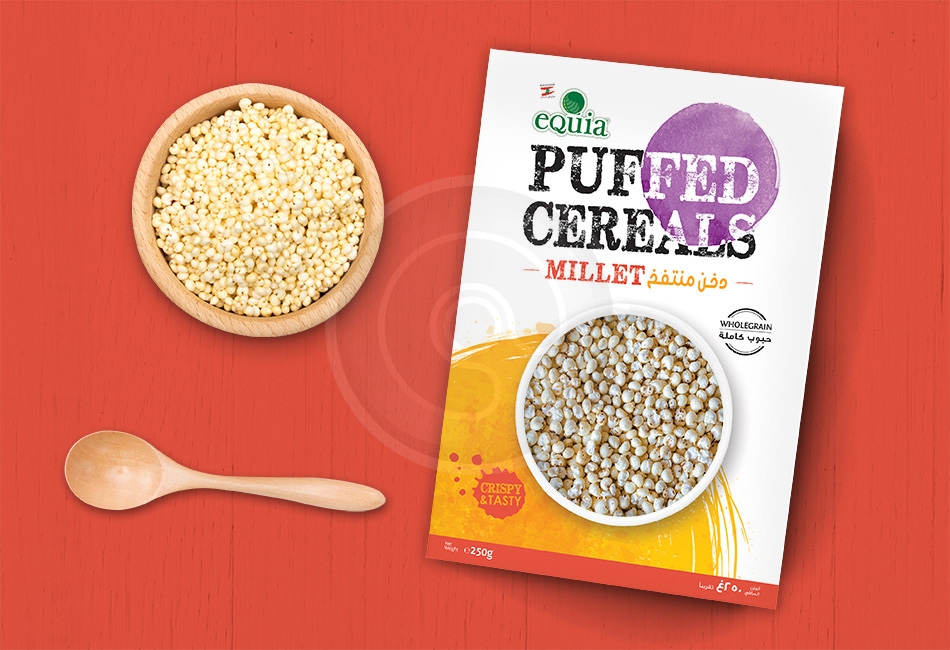
Low calorie, healthy, fun, light were our main target in creating this modern design. In order to allow consumers to connect with the brand on a deeper level & have a marked effect on them, we focused on:
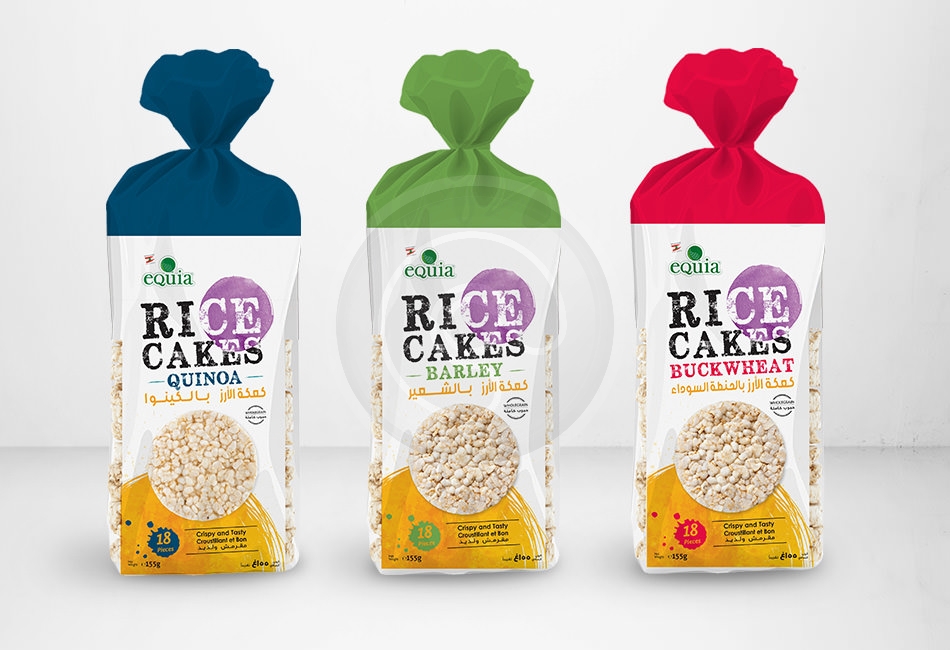
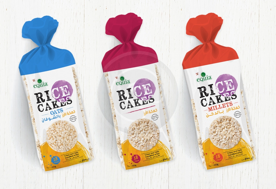
- the artistic touch in the design layout and the watercolor splash provides a light and fluffy feeling (and will be related to the Low Calorie line)
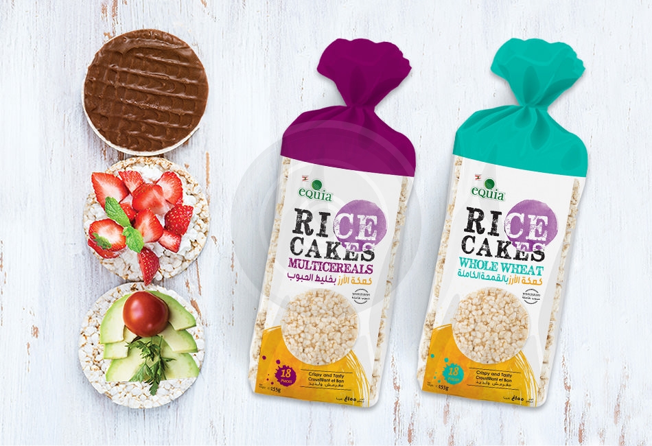
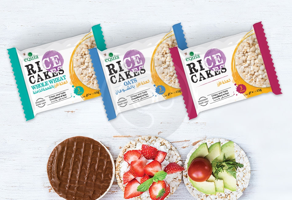
- an artistic and joyful color combination gives a fun, energetic and emotional experience
- despite using the color combination, the white, transparent part reflects purity, clean and healthy feeling
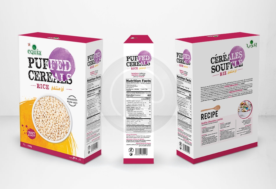
- a modern, stylish typography with overlays, taking into consideration 3 languages in a clear way without confusing the consumer.
We were also able to follow FDA international rules for global exportation reasons.


