Challenge
Ajax is an American brand that provides the consumers with cleaning products that have a strong market presence. Our challenge was to create a design for a promo area that will reflect the brand’s message and the product’s cleaning impact.
Creation
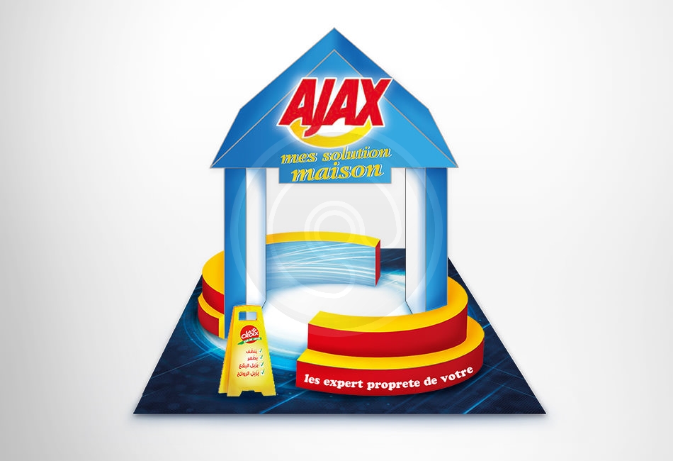
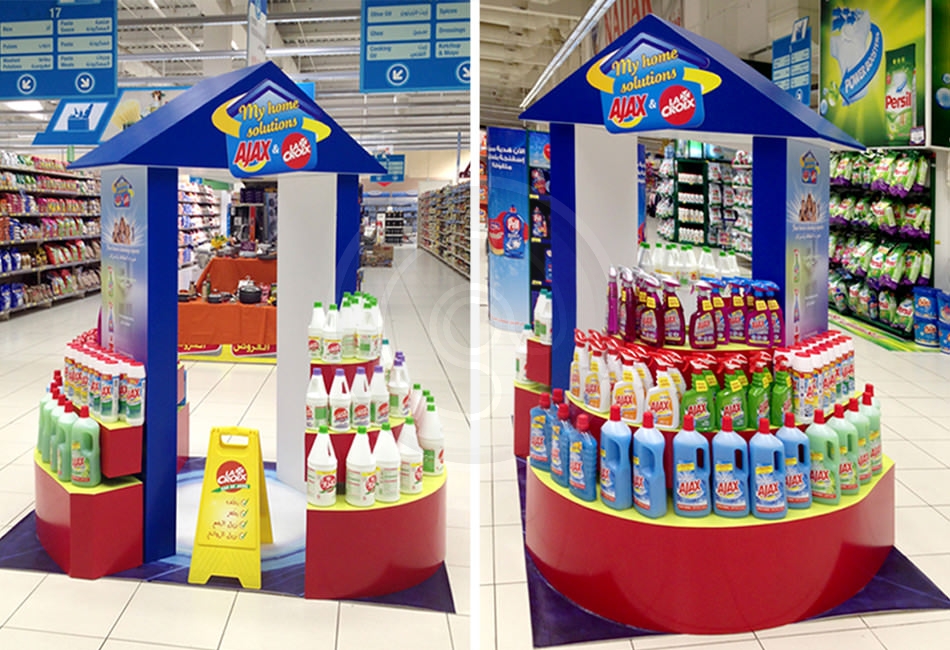
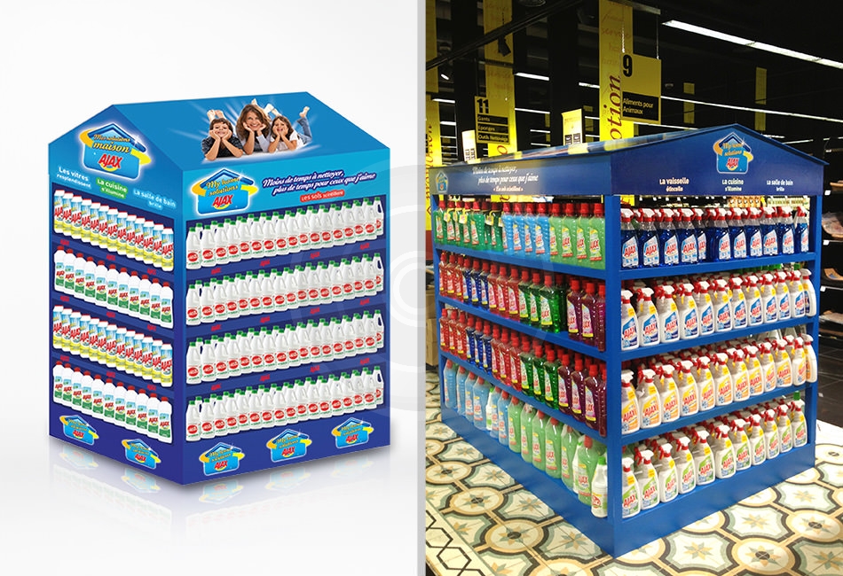
Since Ajax’s is a strong household cleaning, our inspiration came from home, and the promo area was designed with a home-like structure. The idea is that the home is being protected by Ajax in a circular form, which is the symbol of protection. Also, you can see through the visual the white effect that portrays cleanliness, and the caution sign which warns people that this is a sanitized area. In addition we produced various stands to be a self-supporting structure that was simple with a clean design which could be placed in various locations. We also took into consideration the portability of the stands and how easily the units can be placed in a sense that we achieve maximum visual impact.


