Challenge
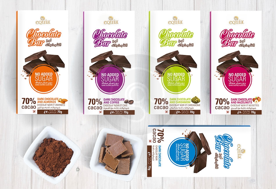
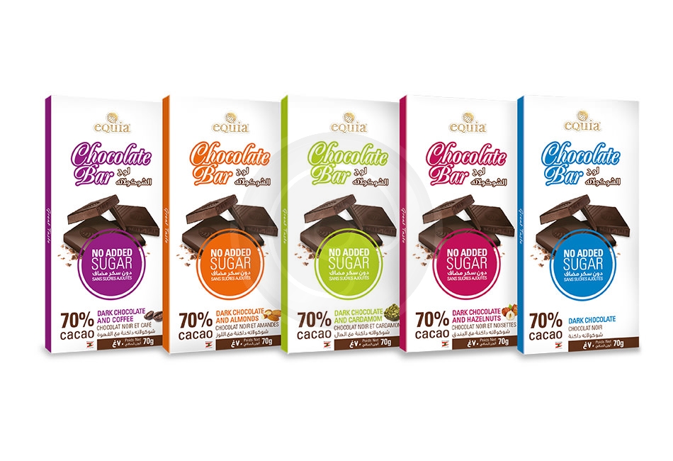
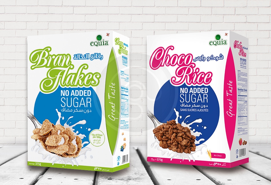
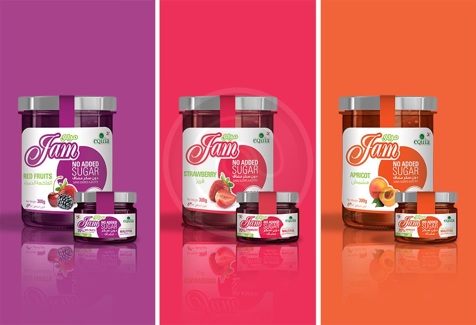
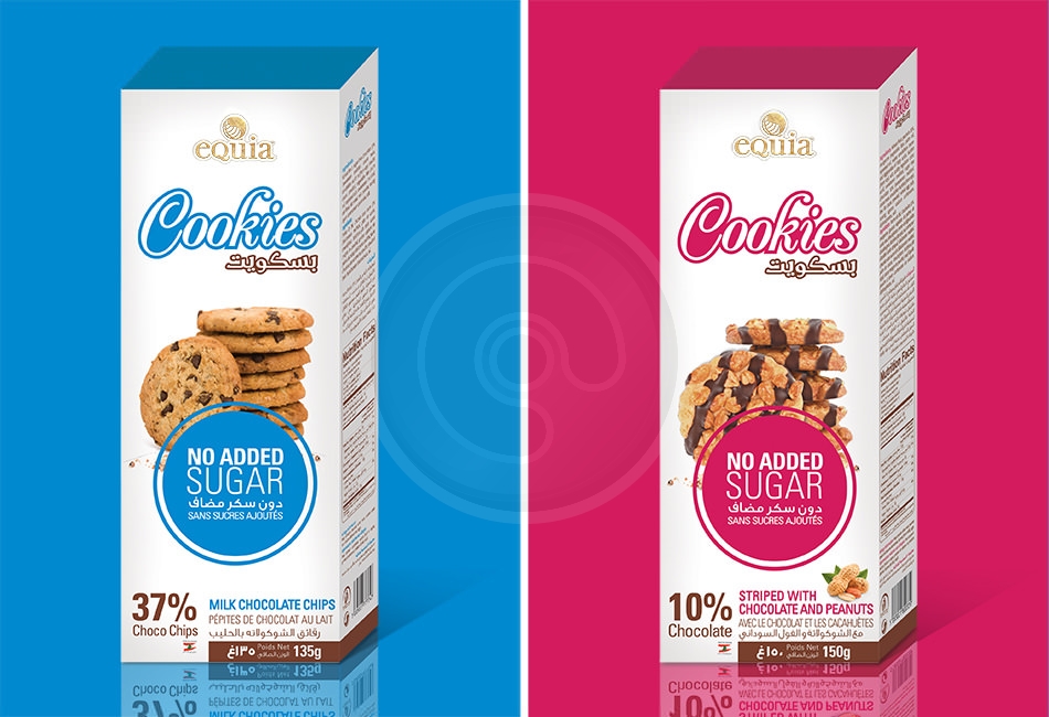
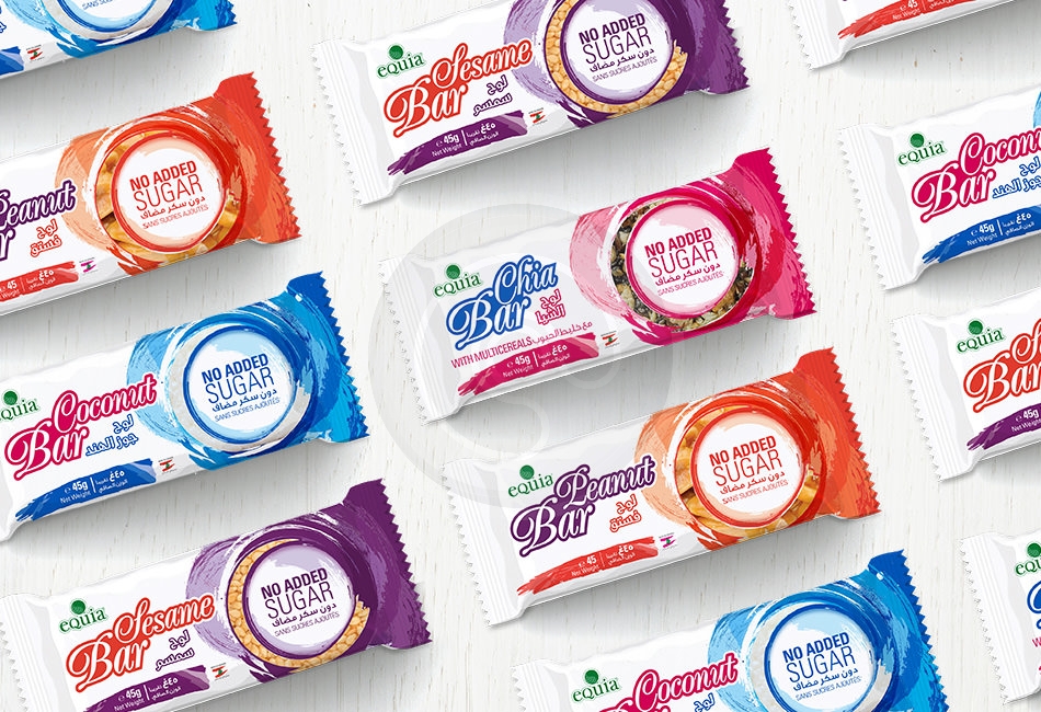
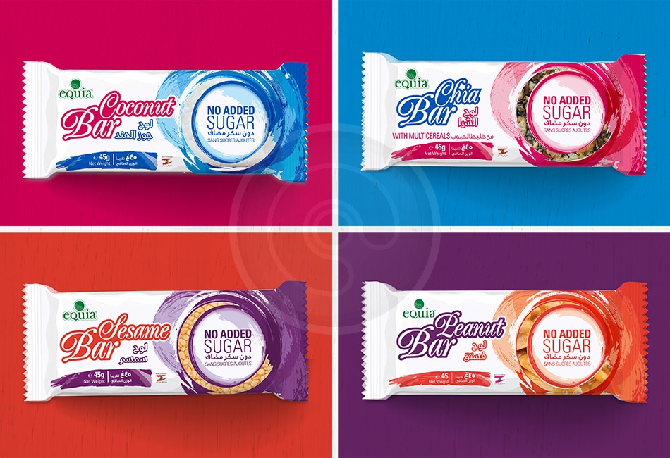
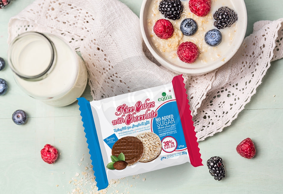
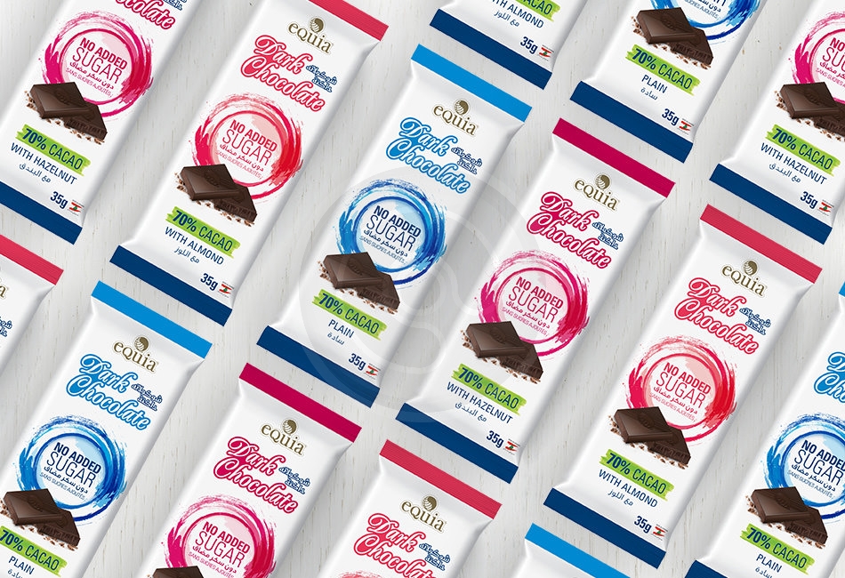
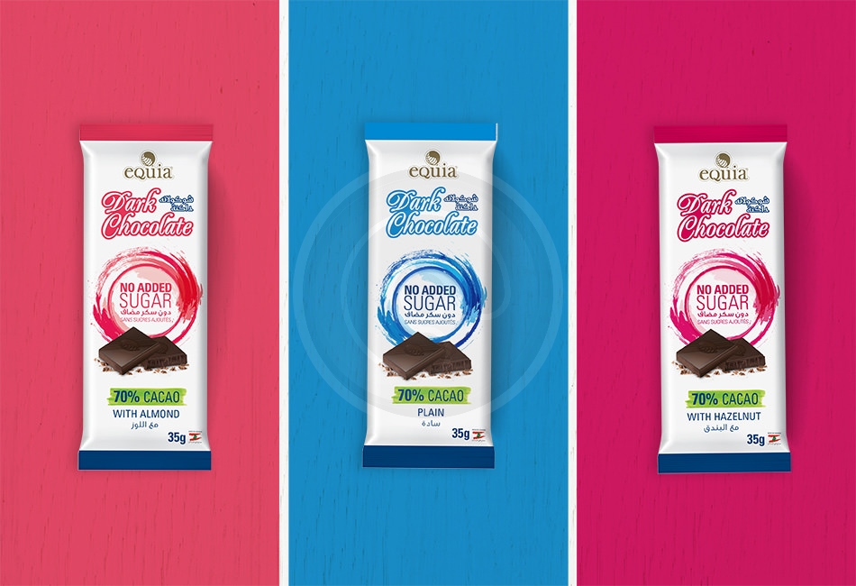
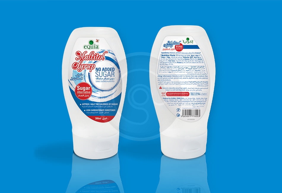
No added sugar line has a wide range of products that targets individuals that wish to control their sugar intake. Our challenge was to create an identity that is easily recognizable to these individuals wherever they are.
Creation
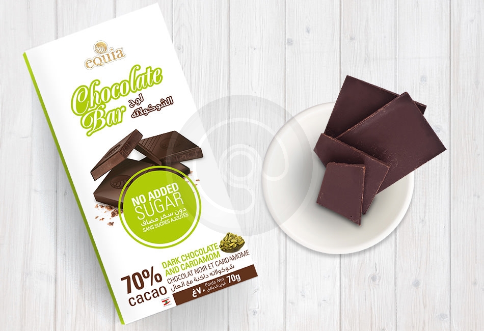
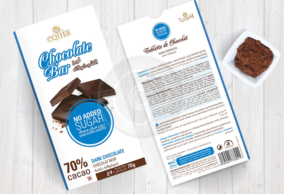
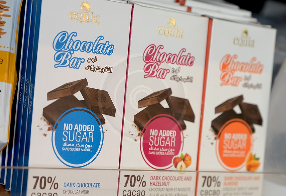
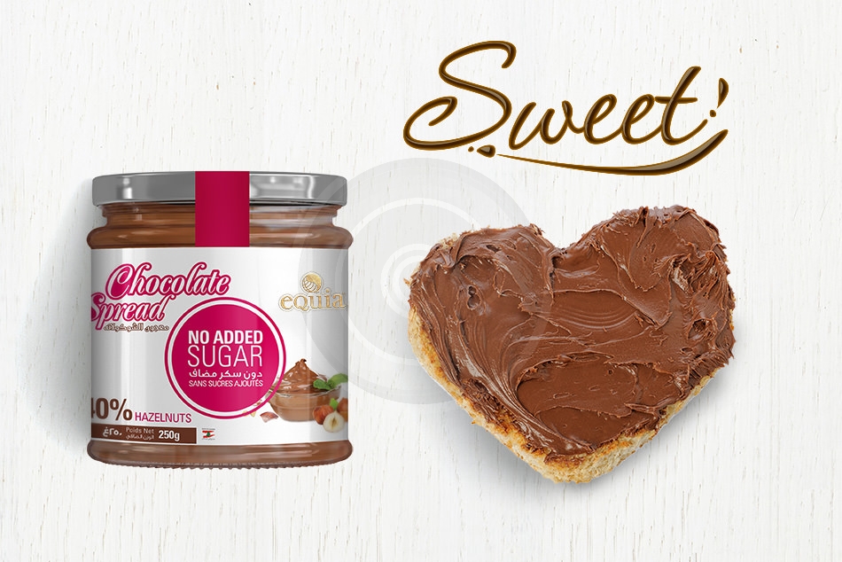
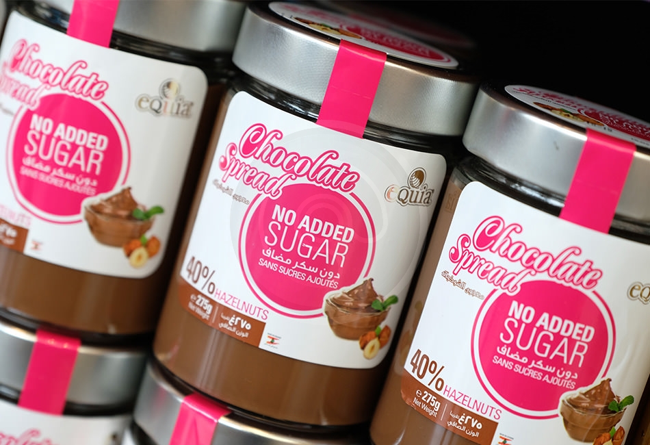
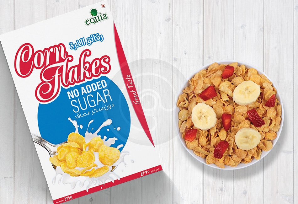
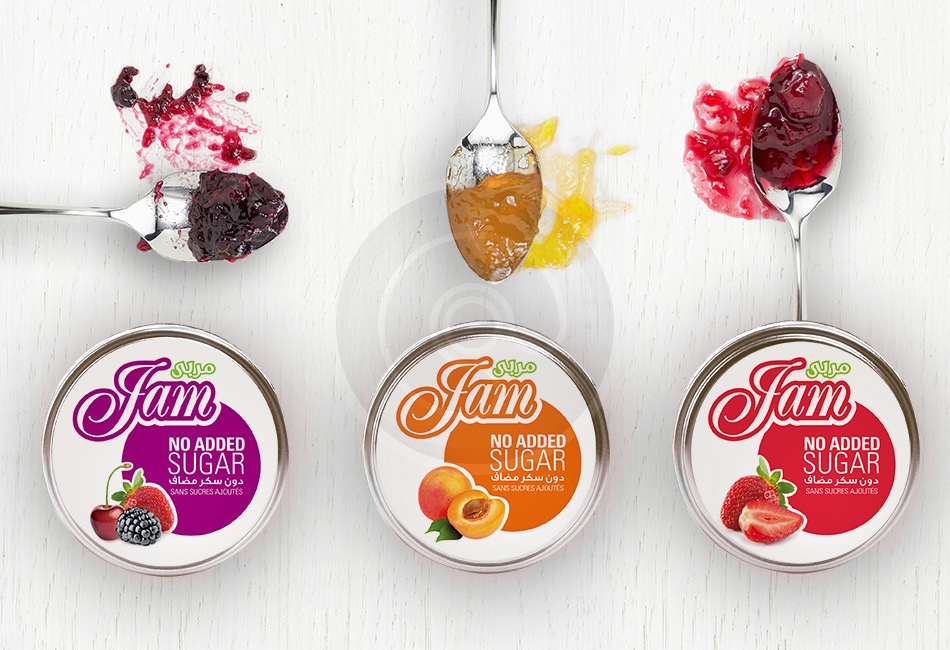
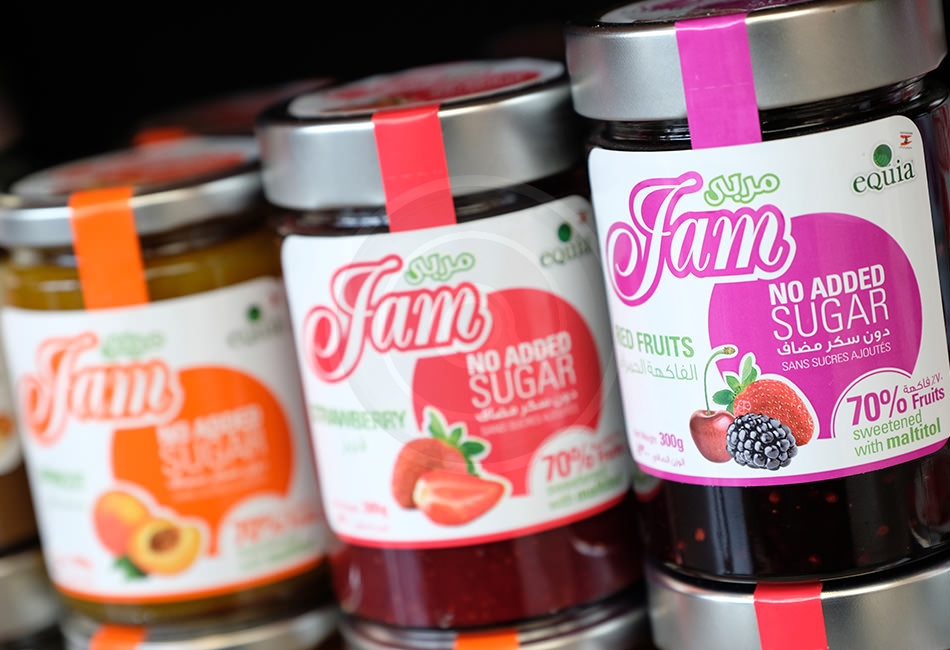
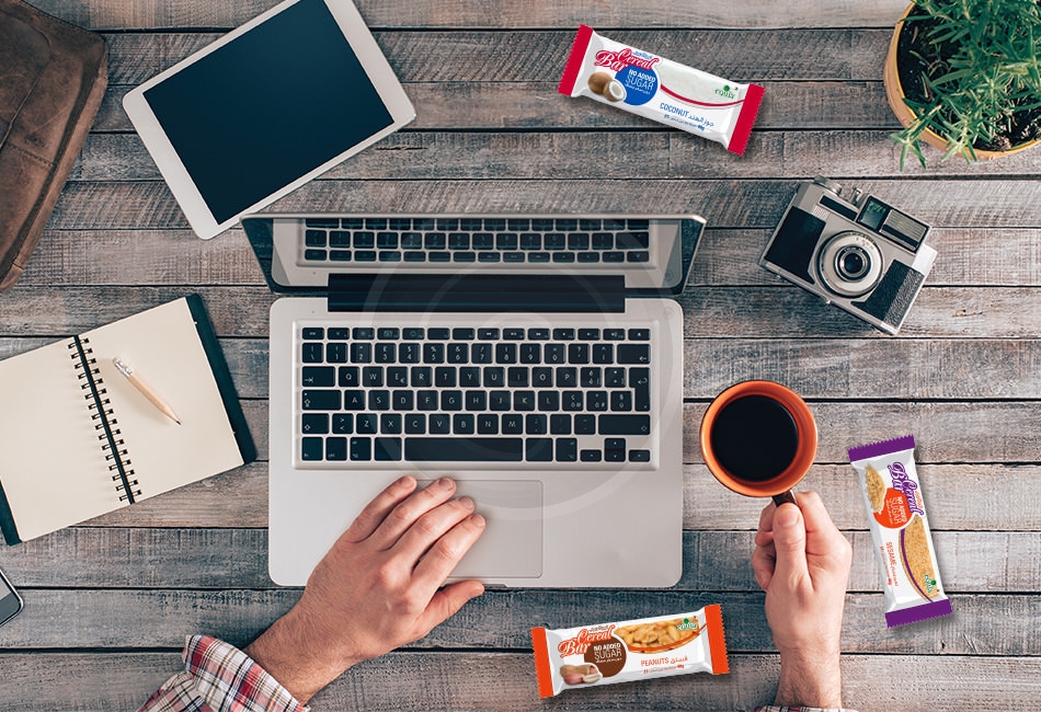
We created a light, healthy, and simple looking packaging that is easily recognized by people with diabetes. We used the blue circle as a main point of differentiation in the identity since it is a global symbol for diabetes. The light color palette used and the diabetes symbol adds trust to the identity, and helps you improve your attitude towards healthy eating. “Be in control” was the slogan created to show people that they can eat tasty products and be in control of their sugar intake. This is strongly portrayed in the package design that makes you crave the tasty products. Also the design created a sense of a joyful and flavorful experience and a voice that stands out from the crowd and speaks directly to consumers.


